How to prepare a banner for a store? Text and CTA button in the banner.

Banner in an online store is one of the first elements visible after entering the homepage. It has a real impact on whether someone will stay on our page or leave it within a few, several seconds. That's why it's worth paying attention to it and preparing it well.
First of all, it is worth determining what our goal is: banner impressions, clicking on the banner and going to the indicated page.
Banner impressions
The goal is not to click on the banner, but the message it conveys. It may concern the mission of the company, describe what we sell, what distinguishes us, etc. Remember that the message is not only text, but also graphics.
A good banner graphics is:
- matched to the style of the store
- simple and readable
- corresponds to the content we want to convey
Such a banner does not have to contain a so-called CTA button - Call To Action (but should lead to a subpage containing more information). Thanks to this, it can contain more graphic elements and a shorter text.
Clicking on the banner
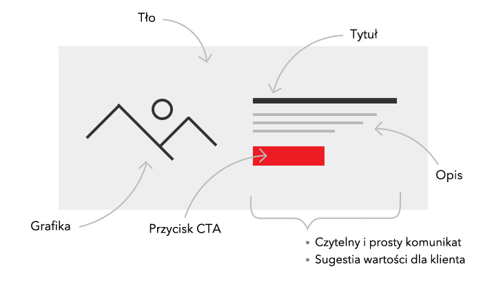
If the goal is to click on the banner, we should focus on encouraging the customer to take the suggested action. Such a banner contains, in addition to graphics, important elements such as: title, description and CTA button. Both the title, description and button should suggest the value that the customer will gain if they click on it.
CTA button
Just like the title and description, the button should suggest value to the customer.
Instead of using expressions suggesting that we want something from the customer:
- Buy now
- Buy with a discount
- Order
- Sign up
it is worth using those that suggest that the customer will get something from us:
- Learn more
- Get your discount
- Check
- Join the club
The message is not so obvious
It is worth remembering that the message we want to convey is not unambiguous with the message that customers read. It is worth taking a few moments to stand on the other side and look at the information conveyed through the eyes of the customer.
Set up your SOTESHOP online store for 14 days for free.
Check out the new version of SOTESHOP 8.


