Better graphics in your store
Graphics is not only the layout and colors of the page, but also the data that is displayed on the page. We have prepared information on how to make your store look more attractive and functional. We have also added new graphic service packages.
Store Graphics
Graphics is not only the layout and colors of the page, but also the data that is displayed on the page: banners, descriptions, photos, placement of elements, etc. If we change the offer or a new season starts, it is worth making changes and improving the store graphics.
When making changes, one should take into account not only the main page, but also the category pages and the product card. Many customers come to the store directly to these subpages, so it is worth taking care of the readability of the information. Additionally, it will have a positive impact on the store's SEO.
Updating Graphics
The following instructions refer to the "Bianco" graphic theme, but will also work for other store graphics.
Home Page
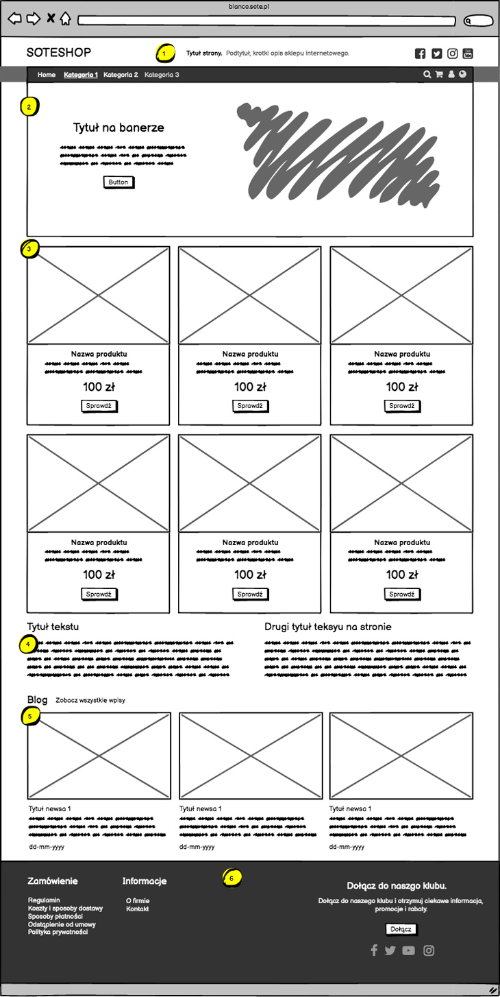
- Header texts.
- The title and description should contain general information about the store.
- It is worth using 1-2 keywords here, as these texts are used for store SEO.
- Banner
- The banner should be readable and attractive.
- It should have a matching size.
- It should not contain too many elements.
- It should be linked and refer to, for example, the category page, product, blog.
- It is worth using the option to add text and a button to the banner.
- Products on the home page
- If we choose products for the home page, we should make sure that the photos of these products are attractive.
- The product list should include shortened descriptions. They improve readability and have an impact on page SEO.
- The number of products should be a multiple of the products in the row. E.g. for 3 it will be: 6,9,12.
- Additional texts on the page
- These are texts that are worth using to support store SEO.
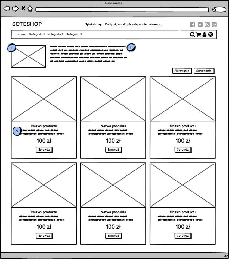
- It is worth adding a description of the category and a photo.
- The photo can be in the form of an icon/graphic or several products from the offer.
- It should have the correct size.
- The description does not have to be long, it should not even be. A longer description will cause customers to scroll the page to see the offer. Some of them will leave the page before they see the products.
- For SEO purposes, it is worth having more texts on the page, so instead of adding a long text above the products, it is worth adding a description under the name. It will be used for SEO.
- If we have many categories and subcategories, it is worth adding a left column in the graphics configuration.
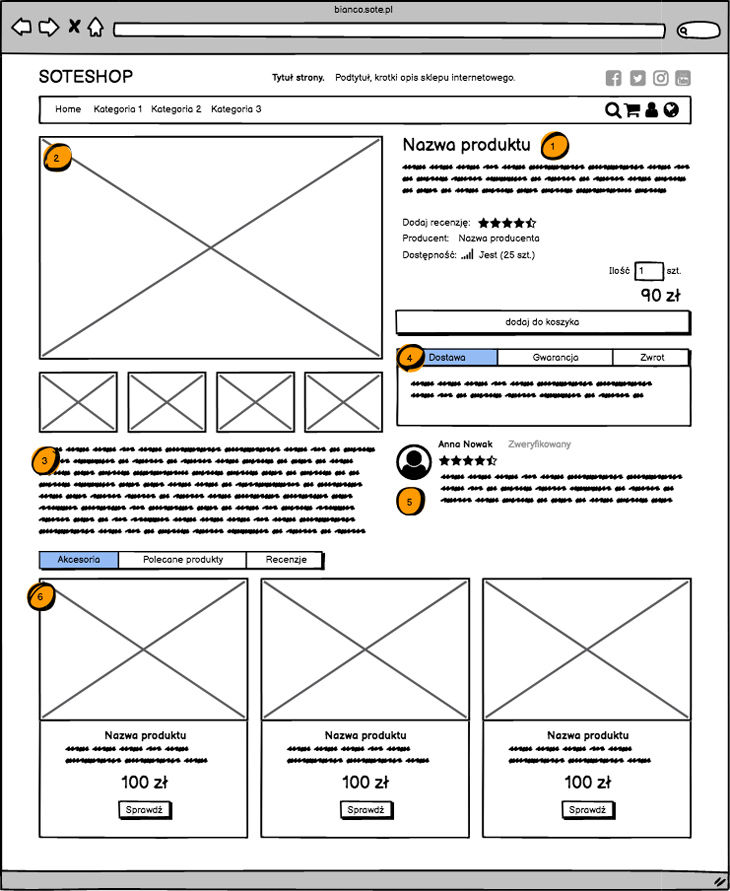
- Name and short description
- These two elements should be filled in together. Like a title and a short description.
- This information will be used on the home page, category page and product card. On each of these pages they will affect the SEO of the store.
- Attention! The short description is not a full description of the product and should not be used for this purpose.
- Product photo
- It should be in the correct size. It is worth adding large photos, the system will automatically scale them and additionally customers will have the option to enlarge them.
- Add several photos.
- Description
- Add a full description of the product and data e.g. specification
- In addition to the description, you can also add photos and YouTube videos to the content.
- Configure additional information under the basket.
- Delivery
- Warranty
- Return
- Add one or several highlighted and verified reviews.
- Add Accessories to the product and recommended products.
- First of all, we prepare the page for customers, not for robots.
- The time spent by the customer on the page is one of the most important elements of page positioning.
- Good photos and descriptions are key to positioning. This applies to both products and categories.
Categories
Products
SEO
New Graphic Packages
If you need help with implementing graphic changes and optimizing your store, please check out our new offer.
We have prepared new graphic packages to help our customers improve their store. They are intended not only for new customers, but also for those who already have a ready store and would like to optimize it.
Order the graphic update service in the package.
Related Pages
